We’ve all seen those interfaces: Internet Explorer windows with racks upon racks of toolbars, forms with hundreds of fields to fill in or applications with menus that run off the bottom of the screen, or worse, have unending levels of sub-menus. They are confusing, messy, hard to use and even harder to navigate.
This Hiltmonism is simple. One, there shall be no more than five things on an interface element. Ever! No more than five fields in a form section, no more than 5 menu items in a menu section, no more than five things in a toolbar segment, no more than 5 tabs on screen.
Two, there shall be no more than five elements. No more than 5 sections on a form, no more than 5 menu blocks, no more than 5 segments on a toolbar.
And three, there shall be no more than five of anything. If you application is complex, break it down into no more than 5 main areas, break those into no more than 5 sub-areas, and then separate them visually.
And if in doubt, or impossible to remain at five, you can grow to a maximum of seven. But no more. I will come to your house if you do.
Why 5 with a maximum of 7?
It really starts with a seminal psychology paper by George A. Miller of Harvard University, written in 1956 and originally published in Psychological Review in 1963, entitled “The Magical Number Seven, Plus or Minus Two: Some Limits on our Capacity for Processing Information”. (References: The article or Wikipedia).
In short, Miller’s experiments proved that the average person can hold 7 plus or minus 2 objects in working memory at one time.
The outcome of his research and those that followed (especially about the magical number 4 in “The magical number 4 in short-term memory: A reconsideration of mental storage capacity”, Cowan and Nelson, Behavioral and Brain Sciences) can be seen everywhere in everyday life. Phone numbers in the USA are seven digits because of this. And when area codes were added and became too long, parentheses and hyphens were added to break them up into several objects as they are easier to read and remember. (212) 555-1212 are three objects to remember instead of 2 1 2 5 5 5 1 2 1 2, a stream of 10 digit objects. The same applies to license plates, social security numbers and credit card numbers.
And in software? It’s the same. Users cannot remember how to use software when there are hundreds of buttons to push and hundreds of menus to click. So they don’t use all the features of the product, or worse, workaround the features of the product that exist but are too hard to find. No matter how good your documentation and training is, the cognitive overload wins, people forget or cannot find functionality.
If you want to make a product that is easy to learn, easy to use and delivers a great experience, you need to reduce the cognitive load. No more than five. Users can remember and navigate five to seven menus, users are happy with a few pertinent buttons or toolbar items, and users can easily understand the purpose of small forms.
If you follow this Hiltmonism, you will create simple, focussed and very functional applications.
But that’s not possible!
Ahh, but what about massive ERP (Enterprise Resource Planning) systems like SAP, or complex professional graphics programs like Photoshop, or something that has a lot of features like Excel? It’s not possible to do this?
Actually it is, and SAP, Adobe and Microsoft have done amazing things to try to get to a “no more than five” rule, often getting it down to seven or eight, but they still have a long way to go. The ribbon interface is a good start, replacing too many toolbars, but still to busy. SAP’s module breakdown and navigation systems have been cut to the bone, and Photoshop’s menu madness is slowly coming under control. But these are professional grade applications for professional grade people, people who are prepared to deal with complexity.
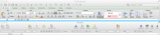
For regular folks, there are products just as functional with far simpler interfaces. Compare Excel (top) to Numbers (bottom), Excel has a heap of buttons on the toolbar, Numbers only has a few, it’s simpler, more focussed and easier to use:
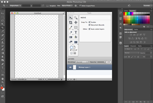
Or compare Photoshop (dark window chrome) to Acorn (light windows chrome), Acorn has a far more compact and simple interface, yet can do a lot of what the complex Photoshop interface does and with a lot less effort:
Some rules to help
If it can be done, then how can it be done? Here are a few rules to help you get to the “no more than five” rule:
- Create what is needed, and no more. Build software that meets the needs of your clients, and forget the rest. Don’t add features and functions because they want - but will never use - them. Don’t add features just in case a future feature may be needed.
- Show the frequently-used stuff, hide the rest. Figure out the things that will be clicked on the most and make them prominent, and hide the rest. Professional users who need these other features will find them and remember them, but most of your users will stick to the common stuff.
- Make decisions and prioritize for your users. Decide what and how things need to be done, don’t make users decide each time. And if there are different flows, enable them in preferences so the default flow happens automatically. Then prioritize the data needed, placing the highest priority functions and data fields at the top of screens. Hide the low priority stuff, or even better, place it elsewhere or get rid of it.
- Break things up into logical components, and then fence them in. Editing and formatting a document are two different things, which is why most operating systems separate the edit and format menus. In your application, break it up into components, and then, when a user is interacting with one of these components, only show them the functions for that component. They can navigate to another component if they want.
- Actions go with data, and nowhere else. Display the things a user can do with a piece of data, ways to navigate to other areas in the system and nothing else. When working with data, show the user what they can do with that data and only that data. Let them navigate to other data if they want, and see the other data’s actions, do not clutter the interface with actions on other data.
- Prune the tree. Business changes, needs change, and your application should change with it. When a function is no longer being used, or no longer a priority, move it, hide it or prune it. Be ruthless. You used to need a field and now you don’t, hide it. If you need to go back in time, the data is still in the database.
And the benefits?
So why follow this advice? Well:
- Navigation is easier. Users can choose the area they need to work in, and go there first. We’re all very good at navigating a simple landscape with a few landmarks and we’re all good at working on a task by task basis. We’re not good at making up a workflow as we go in a featureless landscape.
- People can work faster. Smaller forms, limited actions and focus means that users make fewer decisions while using the software, and fewer decisions mean that they can be more productive with it.
- Easier to learn. A simpler navigation structure and focussed actions means user can pick up and “get” the software in less time. It’s less imposing if there are only a few things on the screen to do.
- Better clarity, reduced click fear. With fewer things on the screen, you can make those few things more clear, even more verbose, to help users understand what is happening or will happen when they click. No more needs for your own home-grown abbreviations or terminology to squeeze yet another field in, when good plain english will do. When people understand what is going on, they find it easier to use, they have less click fear - the fear of clicking on the wrong thing and messing things up.
Really, there’s no excuse
A lot of applications, especially internally developed corporate systems, are a confusing mess of buttons, menus and large complex forms. Their users are unhappy, befuddled, and unproductive. The most common excuse for this is that there is no time for IT to “fix” it, so they just add another menu, field, button or report name and move on, increasing the messiness of the system.
That excuse is lame and lazy. It takes no time at all to break a complex form up into sections. It takes no time at all to see which fields are never filled in and to hide them. And it takes no time at all to start cleaning the mess up.
The second most common excuse is that there is no architect to manage the structure of the system and to decide what goes where, what gets split and what gets pruned. Sure there is, every time. These people are called “managers” and it’s their job. They need to know what is used and what is not, they already decide what gets changed, ipso facto, they manage the structure of the system. Make them responsible for this.
No more than five
So next time you develop an application, or change your current one, start by counting the on screen elements. If there are more than five, then redesign, break things up or prune. It makes the application simpler, clearer, more focussed and easier to use. And your users will love it a whole lot more.