One of the biggest headaches I have using Adobe Indesign is the creation and especially maintenance of charts and graphs. In my case, my fund publishes several high quality books and one-pagers monthly and I need to update a bunch of charts and graphs. I also need to print these at a very high DPI, hence Indesign.
I used to use Adobe Illustrator graphs. They are rudimentary, but very customizable. Every month I had to load an Illustrator file for each image, update the graph data and then spend time tweaking the results. Only then could I open Indesign, update links and move on. This took a lot of time.
The ideal solution would probably be embedded Excel charts in Powerpoint or Keynote. But these products are screen focussed, low DPI, and are no good for high quality print output. And unfortunately, Excel produces graphs as bitmapped images, not vector art, so that is no good too.
But it turns out that Apple’s Numbers application (part of iWork on the Mac) does something special when exporting to PDF: it generates all charts as magnificent PDF vector art. And these include the new typography features and hairlines I need.
So here is how I work now.
I have a Numbers spreadsheet with a bunch of tabs. On the far right is the tab containing the source data tables. To the left are tabs containing one and only one graph per tab. The source data for each graph is in the data tab.
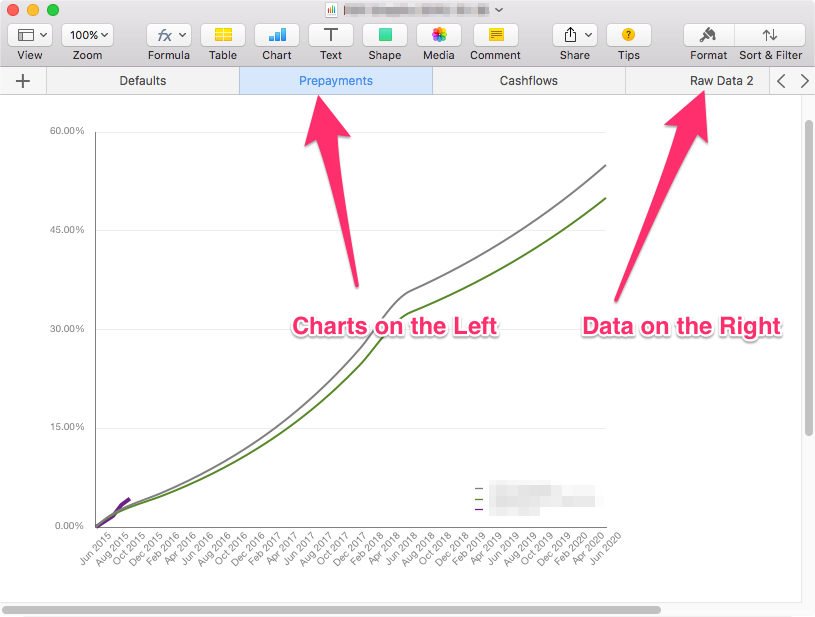
The reason the data is in the right-hand tabs is to ensure that the graphs are always published to PDF in the correct order and present on the same page number every time (see linking below).
Each graph has been created individually, designed to match the book or page theme, the necessary fonts and colors set, even the sizing is preset. All I need to do every month is update the data and let Numbers take care of graph changes.
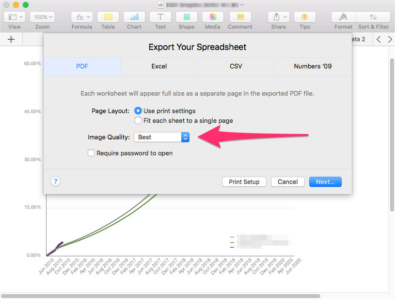
I then export the entire document to PDF (File / Export / PDF…). I set the image quality to Best which seems to produce nice, clean hairlines, and save the output into my Indesign Assets folder, overwriting the previous period’s PDF.
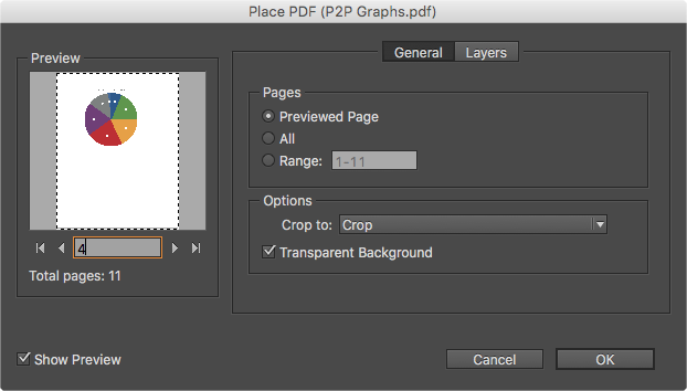
In Indesign, I created the frames for each chart. When placing the chart, I check Show Import Options and select the PDF file. This brings up the below dialog where I select the PDF page (the linking trick) containing the graph I want in that frame. A bit of resizing and repositioning and the graph is linked and placed in the document.
On update days, things cannot be easier, I:
- Open the spreadsheet and update the data.
- I save it, then export to PDF as above, replacing the previous PDF asset file.
- I open Indesign and update links. Since the PDF pages and charts are in the same place and remain the same size, they all update perfectly.
- After changing the monthly numbers and text, I save and prepare for print.
Since Numbers produces high-resolution vector PDF art, I am able to generate quality high-DPI charts in no time and get the books and pages out on time without losing fidelity.
Follow the author as @hiltmon on Twitter.