TimeToCall is a simple, universal iOS application I developed to help people choose the best time to call when calling internationally. This is part 6 in a series of posts about the thinking and work done. My goal is to share just how much effort it really does take to craft an iPhone app and ship it. I hope this series helps you to understand why it costs so much and takes so long to create beautiful software. Back to part 5 or start at part 1 first.
Sweating the Details
Once the core product is written and the design implemented, the next step is always to sweat the details, making sure the little things work right, aligning the planets and making the experience that much better. User’s don’t, and should not, notice when you have sweated the details, but it is glaringly obvious to them when you have not done so.
Sweating the details and polish (see a later post) are the activities and time spent that add the essence of quality to an application. It takes time and thought and iteration, but you cannot produce beautiful software experiences without it.
There is no one right way to sweat the details, the only approach I have ever used is to use the app a lot, show it to my friends, and see what breaks, annoys, or just does not work right. Then work it until it does.
Here a some of the details in TimeToCall that were sweated, and solutions chosen.
Slider Accuracy
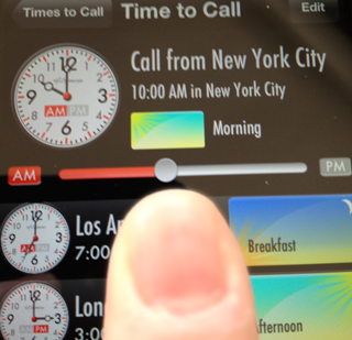
Initially I had the time slider set up so that it represented every minute of every day. Logically, this makes sense since we’re trying to ‘play’ with time in the app. But the problem was that my fingers on the tiny iPhone screen were never able to drag the slider to exactly the time I wanted. It was always off by a few minutes. It was less hard to hit a chosen time on the iPad as the slider is bigger, but still hard.
I considered snapping the slider within a few minutes of the ten minute mark, but that missed quarter hours, and 5 minute snaps were too small to hit too. So I changed the slider to snap to 15 minute increments. It’s now easy to hit a ‘round’ time, and who really schedules calls at 9 minutes past the hour anyway. The result was as intended, it is now easier to drag the time slider to a more accurate time on all devices.
Double Tap for Now
During the beta, one of my testers wanted to know at-a-glance what the time would be if they called now. The idea being that they already have a scheduled call group, but were wondering if they could call the group out-of-band now.
So I added a double-tap on the slider handle to jump it to the current iPhone time. Nice, but that changes the original scheduled time. So I enabled double-tap again to set it back. Now you can toggle between scheduled and now easily.
The Clock Animation
Originally, when you set the time, I just blitted the clock hands to the correct time. The clock hands would then flash-jump to the correct time. I hated that experience. Real clocks in the real world don’t operate that way and users did not see the clocks change.
So I animated the hand movement, I made the hands ‘spin’ to the correct time. The hour hand would animate to the correct hour and the minute to its. But that too was disconcerting because analog clocks are based on physical gears and the only way to move the hour hand to the right place is for the minute hand to spin all the way around. That’s the ’natural’ movement for an analog clock. So I changed the animation to act as if gears were involved and the minute hand now spins around the face for each hour moved.
But this animation happened so fast that it was still jarring. In the real world, you spin the hands quickly until you get close to the right time, then slow down to be accurate. So, to implement that experience, I animate the hands at ludicrous speed until they get close to the time, then slow it down as if it’s trying to be more accurate. And I think this experience feels right.
Delete on the Master Cell
When you hit edit on the Master View to delete a Time to Call, iOS displays a red roundel in the left of the cell to be tapped to delete the cell. This roundel pushes the content of the cell over to the right. Which means the third location graphic and my custom disclosure image get arbitrarily cut off on the right. That looks bad.

If the user then taps the roundel, iOS confirms the delete by drawing a delete button on the right of the cell, on top of everything else. Now it looks worse.
So I started to play with what to do when the delete imagery was present. First, I tried just hiding the third graphic and disclosure indicator. But that meant you saw less information when deleting, which made it harder to be sure you were deleting the right cell.
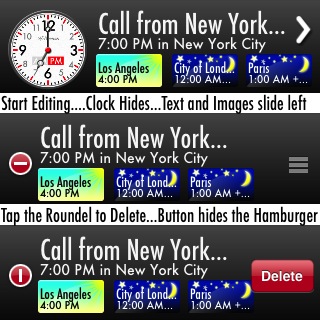
So I started to shift things around. Eventually, I came up with hiding the clock face as it has the least information when deleting, and sliding the remaining items to the left so that they can be seen by the user. That then also made sufficient space for the delete button if the user needs it.
I then animated the return of each to their correct position when the user cancels or finishes editing.
Drag to Order
The default behavior of the app is to add new times to call to the top of the list in the Master view. This is fine, but users probably want to have the most important ones first and less important ones below the fold.
The same applies to places inside a time to call. I assume the user wants the most important places in the call first (and visible on Master) and the less important ones last.
So both the master view in edit mode and the editing screen support the dragging and dropping of lines to change the order of items, which, of course, is saved.
Changing the Call From Location
What if you have a call with several destinations and would like to view it from one of the destination’s perspective?
You could edit the Time to Call, pick a new source location, and then replace one of the destination locations with your current source location. Or create a new one. Basically do it manually.
Too many steps.
So I set it up that if you just used ordering and dropped a destination on the source row, the app would swap the two, and adjust the times accordingly. Much easier and more intuitive.
And if you do it by accident, it is easy to just drop the old source back.
Using the GPS
What would be nice is if the app used your current location as the source when you create a new Time to Call. Well, iPhones and iPads have GPS so I can get the latitude and longitude from the device. And I have the latitude and longitude of each place from GeoNames. And Apple’s location libraries have a distance function for comparing the two. This should be easy, no?
Except for one thing. The GPS takes time, sometimes many many seconds to get a useable starter location to work with. You’ve seen it in the maps app where it starts with the world, then zooms in and then shows a blue dot and a big blue circle that slowly gets smaller as the GPS gets better data. See how long that takes?
I can’t have my users waiting that long for the GPS every time they launch TimeToCall.
I needed a plan B. On first launch, when the app has no GPS data, it creates a single entry to start the user off. This initial entry uses New York in English and Tokyo in Japanese. In the mean time, the GPS is working up a location and finding the nearest city. As soon as it has something good, the GPS shuts down to save battery (another detail sweated), and saves the city.
The next time the user creates a new Time to Call, the app uses this saved city as the source location, which means the user can focus on destinations and ‘playing’ with time instead.
If the user quits the app and starts it using it again later, the GPS starts hunting again, another delay. But if they create a new Time to Call before the GPS is ready, no problem, the app uses the saved location.
This GPS compromise means that the first-run Time to Call is always from New York or Tokyo, and every subsequent new Time to Call will from the users closest large city. And the assumption is made on next launch that they are still in the same general vicinity. It’s not perfect, but it works the best given the constraints.
Next: Part 7: Polishing the App.
TimeToCall can be downloaded from the App Store for 99c.
I hope you enjoy this series of articles on what goes in to the design and development of an iPhone or iPad application, and have a better feel for why these things take so much time and cost so much. If you like them, buy TimeToCall from the App Store, it helps me continue to write, and please tell your friends about these articles and this product.
Follow the author as @hiltmon on Twitter or @hiltmon on App.Net.