TimeToCall is a simple, universal iOS application I developed to help people choose the best time to call when calling internationally. This is part 3 in a series of posts about the thinking and work done. My goal is to share just how much effort it really does take to craft an iPhone app and ship it. I hope this series helps you to understand why it costs so much and takes so long to create beautiful software. Back to part 2 or start at part 1 first.
Two Views or One
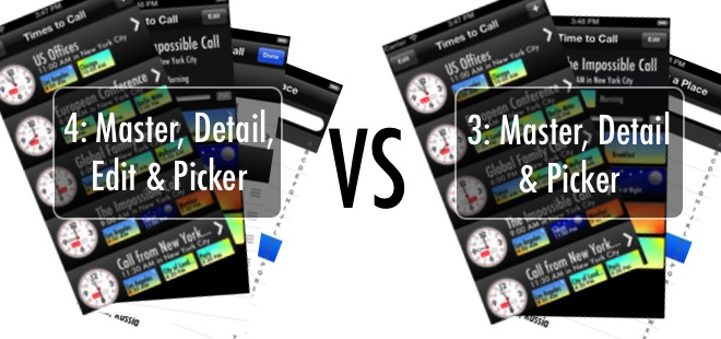
The biggest design decision made in TimeToCall was whether to have a separate Edit view from the Detail view, or whether the Detail view should also be the one to edit a Time to Call.
I chose for them to be separate, but placed the time slider on the detail view. Here is is how I came to this design decision.
Edit and Detail in One View
The benefit of having a modifiable Detail view is that the user of the application can directly interact with the data as it is presented to them. From a user’s perspective, if you can see it, you can touch it and ‘play’ with it. This is the perfect touch tablet approach. Users could then rearrange places, switch the source place with any of the destination places, change the time, edit the name and do all they can interactively on a single screen.
However, the negative of this combined view approach is that it becomes too easy to change the data. Sure, it is fun, but there is no clear way (without implementing an ugly undo button which is not HIG compliant) to ensure that fat fingers or experimentation do not change a Time to Call into something unrecognizable. I don’t want users to accidentally or unintentionally change the data. Further, I assume that the user of the application is going to spend little time creating and editing Times to Call and more time just looking them up or ‘playing’ with time. I did not want users to be afraid to open up the application.
Separate Edit and Detail Views
On the other hand, the benefit of a separate Edit view is that the user has to actively declare they want to change things. I can also make the Edit view look so different that users know they are changing things, and I can put up a cancel button (which is HIG) in case they want to revert. The Detail view then becomes a “Show Me” only view, a little more boring and flatter, but it does give the user a feeling of comfort and safety when looking at a Time to Call (as well as more detail about the Time to Call).
But then the app looks and feels less cool. First-time users will try to rearrange places, hunt around for a way to add new places or change the places they see, and become frustrated when the UI does not respond. Only when they eventually find the Edit button will they realize that is where to go to change things. And that’s not optimal either.
Of course there is a third option, having a Detail view with an Edit button that transforms into edit mode and out again, just like the Contacts app on iPhone and iPad. It works well on iPhone, but unless you are using a seriously skeuomorphic design on iPad, I think it looks awful. No dice.
Choosing the ‘Right’ Design
There is no ‘right’ way to do this, different applications and different designers made different decisions. But I think it’s important for a software designer to create opinionated software, and therefore every design decision, good or bad, should at least have a reason.
Since I really wanted users to be okay with handing their iPhones or iPads over to friends and colleagues to show them Times to Call without worrying that they would accidentally change, I chose the separate Edit view in my design. I also chose to make sure it looked very different so that the user, at a glance, can tell when they are editing and when they are ‘playing’ with time.
But, if I followed this model religiously, there would be one pain point. The one thing that the application excels at is enabling the user to ‘play’ with time, to visualize when is the best time to call. But this ‘play’ would be hidden away on the Edit screen in a canonical implementation. It would be frustrating to have to edit the Time to Call each time just to find the best time. Since the whole point of the app is to enable users to ‘play’ with time, that should be the front-and-center feature, and so that belongs on the Detail view.
As a result of this decision, other opportunities arose. It enabled me to create the possibly unintuitive, but fun way to trigger the optimizer by allowing users to tap the AM or PM markers to get the optimal earliest call time and optimal latest call time. And it enabled me to create the double-tap on the slider to go to ‘now’ and double-tap to go back.
My point is that it did take me a while to make this decision as it affects the entire core code base and architecture. What really pushed me to this design decision was that the key feature, ‘playing’ with time, needed to stand out. First-time users of the app instinctively grab the slider and drag it around to see what happens, just as I, the designer, intended.
Next: Part 4: Presenting the Clock.
TimeToCall can be downloaded from the App Store for 99c.
I hope you enjoy this series of articles on what goes in to the design and development of an iPhone or iPad application, and have a better feel for why these things take so much time and cost so much. If you like them, buy TimeToCall from the App Store, it helps me continue to write, and please tell your friends about these articles and this product.
Follow the author as @hiltmon on Twitter or @hiltmon on App.Net.